Given that I don’t read Japanese, it’s rare I get to make direct comparisons between an original manga volume and its English translation. So I was excited to see how much I could find out about Sherlock: The Great Game.
This is the third, concluding volume in the manga series telling the story of the BBC show Sherlock‘s first season. It was published in English by Titan in 2018. I have a copy of the original Japanese printing of the bilingual edition due to a dear friend’s gift. (The best reason not to be shy about your fandoms is that, if your friends know what you like, they think of you when they come across oddities like this.)
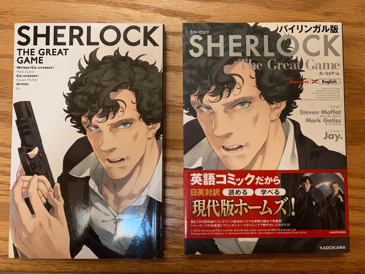
The English version has a cover price of $12.99 and is a fairly standard black-and-white paperback. The Japanese version has a cover price of 1200 yen (about $12) but is more nicely presented. It’s got an actual removable cover (although the underneath is plain white) with flaps. Plus, the belly band (which I can’t read) has the TV picture, in case you weren’t sure what this was based on.
I also like the cover image better. The English version makes sure to show the gun, which, while it does happen in the episode, is fairly atypical of the character and show. The Japanese version puts the focus on Sherlock Holmes, as played by Benedict Cumberbatch, which is where we want it, right?
The best thing about this manga volume is that, as I mentioned above, it’s bilingual. The dialogue is on the page in English, with Japanese translations in the gutters and around the page edges.
The text was surprisingly similar, although not identical. Sometimes an “oh” or similar unnecessary verbal tic is included in the Japanese but not the English. Overall, I prefer the English volume’s treatment. The ballooning is more natural, based on dialogue breaks, and the text is centered in the balloons instead of the left-aligned approach the Japanese manga uses. In the English, the font also mimics hand lettering, instead of the serif typewriter-looking one used in the original manga. The English version adds bold for emphasis, which is missing from the Japanese edition.
The size of the art is slightly larger in the English version, as it doesn’t have to make room for the translations and occasional footnotes. (I’m curious to know what the note on Mrs. Hudson’s “Sorry, love.” said. I assume it’s explaining the pet name.)
The books also finish differently. The Japanese version has ten pages of background information and Q&A that wasn’t translated, so I don’t know what they’re covering. (One paragraph explains “bloody” and another talks about Speedy’s cafe, though.) In the English version, we get a cover gallery of the various alternate covers that were put on the comic issues, although they don’t look nearly as cool as the real-life color versions.
So that was a fun exercise. Although I’ve fussed at Titan’s attention to detail before, I admire the job they did with this.
Related Posts:


