[This article is from The Book Blog contributor Timothy Booksker with photos from Yegor Malinovskii.]
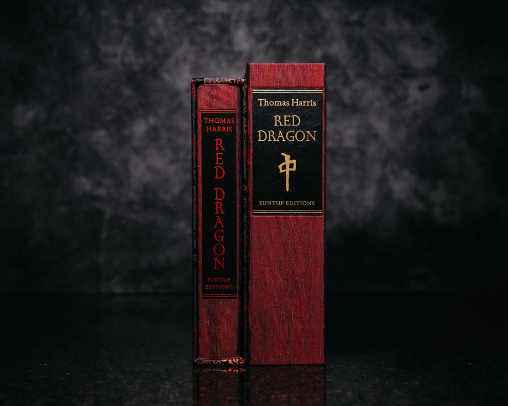
The most “outside” part of a Suntup book is the enclosure. I almost said “typical Suntup book” but then I double-checked and every single book in every single edition has an enclosure. Not only is this a fine feat of engineering, given the wide variety of books produced so far, but a testament to the perseverance of the design team. Every book has an enclosure, and every enclosure is thoughtfully designed to enhance the book. This isn’t a small thing. I could write a whole essay about just the variety and design of enclosures here (and probably will). But to focus on the enclosure at hand, here’s a comparison of the numbered edition’s slipcase (left) and lettered edition’s clamshell enclosure (right):
And here is the case/book spines:

Design-wise, I think is a case (no pun intended) of realizing that you have something good on your hands and stretching it further. What do I mean by this? Well, the numbered Red Dragon is a very beautiful book, made with excellent iridescent Japanese cloth. The lettered edition traycase utilizes this very same cloth. Here’s a shot of the numbered edition:

And, like the numbered edition, there’s a black leather spine label. The lettered edition is inset a little, and is gold instead of red, but the fantastic title font (a beautiful serif font) is still present. The spine label is organized a little differently because of the size, and features the Red Dragon mahjong symbol, something that we’re going to repeatedly come back to, and is quite the perfect design touch, given its place in the book. The edges of the traycase are black, which is a good choice because the red cloth is all the color we need here and so the edges give it a clean look that doesn’t take attention away from the main stars.
In fact, the second main star of the traycase is also next place we’re going to see the Red Dragon tile: the clasp.

Owners of Misery will recognize this style of clasp, which is potentially helpful in keeping the case closed but is mostly decorative (in part because this is a well-designed clamshell case that hugs the book just right and is unlikely to slip open by itself anyway). This is white acrylic and with a little yellowing would look very similar to bone. I do have a slight issue here, and it’s that the clasp (like Misery) is on the front of the book. This is a much better presentation than if it were on the fore-edge, and clearly presentation is the (correct) motivation here. However, it does make it a tad difficult to shelf this book. You need a small gap in between it and the next one, and if you forget about why you need that gap and try to replace whatever book you are storing to the right of this one, you will hit the clasp.
Onward, to the interior of the traycase! The front, back , and spine of the interior are a smooth, black suede cloth.

Not only is this another good design choice – classy, and not detracting in any way from the majesty of the book it holds, but it serves a bit of a utilitarian purpose: keeping the leather safe. This leather has a lot of depth in parts (and whether that part is the spine or the front board differs between books, which is excellent), and you don’t want that depth crushed over time. Suede is a perfect choice here – it’s soft enough that while the leather “scales” will leave slight indentations, the small amount of cushion provided should stop the scales from losing depth over time due to handling. And yes, this is absolutely a book you want to handle.
Now – to the main design feature: the boards. The Red Dragon ‘dragonskin’ boards:

And in different light:

Not only is this just a perfect design choice, it’s also a throwback to the earliest pre-Suntup days of Dragon Rebound Editions. As many have seen (and if you have not, go to the Dragon Rebound site and check it out), there were two versions of the first rebind, The Eyes of the Dragon. The more common variant is green embossed cowhide, meant to evoke a dragon. But the embossing is shallow, and while it has a beautiful texture, it’s not very deep.
The much less common variant is black caiman skin. This has a wonderful texture as well as some nice depth, but the pattern and quality are less even. The boards on Red Dragon are a great example of how bookmakers learn from each other and, sometimes more importantly, build on their own previous work. Here we have both the perfect coloir and, more importantly, an incredible and unmatched texture, which utilizes embossed cowhide (a variety known as hornback, after the alligator hide texture) to give the binder more precise control over the pattern and the quality.

The scales are beautiful – flawless, soft, and deep. It has a “give” to it, which to me is one of the hallmarks of a high quality leather (along with softness – nice leather is soft, not hard, even when you dye or pattern it).


And there appears to be at least two binding styles – one with the ridges centered on the front boards, and one with the ridges centered on the spine.
This is very thoughtful bookbinding. Often with fine leather (an expensive material) the goal is to make as many books out of as few cuts of leather as possible. Thus the position of the natural grain, or the pattern (if there is one), is often not identical between books, and sometimes there are copies that look prettier, or less pretty, because of it.
In this case the choice appeared to be whether to center it on the spine or on the front board. Almost certainly it required more skins to complete the same number of books, because the pattern dictated the positioning, as opposed to trying to fit as many books into as few hides as possible. While the grand overall design of these boards is superb, it’s the cumulative effect of things like this that makes Suntup Editions one of the more “thoughtful” publishers in terms of design and execution. It adds a layer on top of “great” that distinguishes “publishers with fantastic ideas” from “publishers with fantastic ideas and drive to execute those ideas as perfectly as possible in every book” – a key distinction that you very much want in a lettered production of this caliber.


Last stop on the outside – the top. Here we have deep red rust-colored headbands. Which blend perfectly with the boards and endpapers! I like the monotone as opposed to multicolour here, as there’s no reason to introduce a second colour. And same with the choice to forego a topstain – there is already so much going on with the boards that it’s unnecessary, bordering on distracting, to have a topstain.
Let’s have a look on the inside.
The first thing: endpapers. I was very curious about the endpapers here. Something understated, maybe monotone, that won’t take away from the main attraction (the boards, clearly)? Something more extravagant – not anything that would compete with the boards, of course – but maybe with a pattern, or handmade? And what did I get – an incredible, pleasant, surprise.

I am a huge fan of hand marbled papers, almost to a fault. In my mind, there was nothing that could ever be lost by using hand marbled papers as endpapers, and everyone who didn’t use them, should have. I still feel this way, but dialed back maybe 20{8cf42eee1263fb36ad60c6660cad5304004dad224debe245ba4d38f99dbf0948}. The publisher that cured me of this – Suntup Editions, of course.
First of all, with some of the incredible patterned papers we have seen over the years (Misery). Second, with as much as can be going on with the boards of these books, I do now understand how marbled endpapers can be seen as competing with other design elements of the book. So, given just the exquisite production of these boards, the main attraction, the stars of the show, I never would have expected hand marbled papers. Going back to the Suntup site, it clearly says “endsheets are hand marbled” but man am I glad that I either didn’t process that, or forgot about it, because I was floored by these sheets.
The colour is spot-on: oranges and whites, interesting but appropriately subdued. The pattern is an old one, called “bouquet” or “peacock”, and involves the use of a double-toothed comb. It’s slightly “fiery”, though not like the endpapers from the Dragon Rebound Eyes of the Dragon, which would definitely have been too much here. I think the white is really necessary to tone them down to the point where they don’t compete with the boards, but complement them, which they do – absolutely perfectly.
These endpapers are the supporting actor whose presence is nice in and of itself but who has the extra talent of making the star shine brighter than he or she would have otherwise. A superb choice.

Again, let’s take a short detour and look at some shots of the numbered edition endpapers, which are also very nice. A totally different palette here: green, dark blue, red, white, and just the slightest touch of a yellowy gold.


The numbered boards are a different hue from the more ruby-red of the lettered edition – they’re darker and shot through with some gray – so these (mostly) darker endpaper colours, especially the green, suit the numbered much better than the lighter orange in the lettered.


Now – into the book.
Obviously the biggest component here is the paper itself. It’s really quite amazing how thin or thick a book can end up based on the paper used. This is a decently-sized novel – roughly 350 pages in the first edition. Here it’s a bit longer, due to the interior design, art, etc., clocking in at just under 400 pages. But the Suntup editions are substantially thicker because of the excellent paper. Likewise with the numbered vs the lettered: same design, same layout, but much thicker due to the difference between Mohawk Superfine and Mohawk Strathmore Pastelle. The Strathmore is uncoated with felt finish on both sides, making for a thicker, nicely textured finish, with everything on the inside looking better because of it.
The typeface used for body copy is Golden Cockerel, based on designs created by Eric Gill in 1929 for the Golden Cockerel Press in England.
The title page:

Wound Man:

Even more gorgeous Mowry art:

The paper soaks up the ink very well, with the felt finish of the Strathmore adding a wonderful texture to the art:

The two-color printing, which can seem like such a small thing, really brings every page to life. To have a chapter heading, or mid-chapter break, or accent in another colour can really draw you into the story in an unexpected way.

Finally, after this absolute tour-de-force, we end with the limitation page. This is nice both because of the design, but also because of something completely out of the control of the press: the signature. Top billing for penmanship goes to JRR Tolkien and early Stephen King. Harris, signing with a fountain pen, belongs right up there, with Mowry not far behind.

Well – that’s all for now.
For everyone who made it through all of the words, or even most of them: thanks for hanging in there and I hope you enjoyed this. For those who just enjoyed the pictures – I can’t blame you, they’re fine examples of the photographic art.
Thanks for reading!