[This article is from The Book Blog contributor Timothy Booksker with photos from Yegor Malinovskii.]
Today I’d like to talk a lot about Full Throttle, the lettered edition of which was put into the world recently by Subterranean Press.
This book got a lot of hype when it was released a couple of weeks ago (for very good reason) but I feel like to some extent the book itself got lost in all the talk about one particular page – missing the forest for a tree, as it were. And it really is a very nice production. So, to remedy this, let’s take a holistic look at this edition, with much-needed (and greatly appreciated) photography from Yegor. I think these pictures do it more than enough justice but it’s a recent favourite of mine, so here are some words about it:
As always, we’ll start on the outside and work our way in.
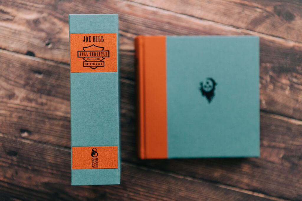
First – the traycase. Without question, the first thing you notice with this case is the interesting and very bold colour scheme. Teal and orange are not necessarily two colours that you might think go together… but, I have to say: it works. On two levels, actually. First: the colours are both specific callbacks to themes in the interior design and the stories themselves, so using them as the main design colours was both brave and honest to the rest of the material. Second: tying these colours together aesthetically is no small feat, and they get a handy assist in the form of some world-class hand-marbled endpapers.
The traycase is teal, with orange leather spine labels, and there was an excellent decision to use black cloth for the sides and fore-edge of the case. Teal or orange would have really pushed it and it might have been too much. The black tones it down a little – every piece matters!

Inside the traycase is another great feature, made even better by the interesting dimensions of the book: the remarque! The McKean remarques are duotone, (mostly) black and (some) teal, matching the interior design of the book. There is a raised frame of sorts built into the case, keeping the remarque and book separated (though it never hurts to add a thin, acid-free barrier such as glassine, of your own).
Given the boldness of the colours on the traycase and book, this was a better feature than the more common marbled interior front board, I think. It’s a neat way to have a remarque included that is actually displayable! And because of the dark colours it doesn’t compete with, or overdo, the book it faces.


Onto the book itself!
The first notable element is the shape (which is the same as the numbered). The square is an unusual trim size – any square, not just this particular size – not just for Sub Press, but for most of the small genre presses. And for most presses in general, it turns out. Square books just aren’t very common. Most books that don’t fit the standard proportion are books that simply rotate it 90 degrees and are deeper than they are tall. Maybe there is a collectible sub-genre that has a lot of them? It’s a common size in toddler board books, at least, and probably somebody collects those. But for those who don’t recognize the name “Sandra Boynton” square books are probably a very small percentage of your collection… Anyway – different and notable.
The second thing you notice is the color and design –the colors are the same orange and teal from the traycase, but with more orange here as the leather component of a quarter leather binding design. And – absolutely the right call, hands down – no dustjacket on this one.


Now, where do these colors come from? I mentioned at the beginning that I think they’re very intentional colors that come from different elements and needed a deft design to harmonize. The teal started somewhere with the first iteration of the book – the cover of the US first edition is done in duotone black and teal on a tan background. The numbered Sub Press edition leaned into a teal palette pretty heavily, as does the interior of the lettered edition. Some with bluer or greener hues, and some bang-on (like the marbled endpapers). And this is a harder color to catch an honest glimpse of in photographs. In all of the previous photographs of this, the teal has looked too light to me, the orange a bit, too – much more washed out than in person. So thank you to Yegor for bringing these true colours to light here!

The orange took me a minute. I didn’t recognize it at first. I thought it was a bold combination, that it was tied together well (by a specific element we’ll talk about in a minute), but I didn’t quite understand. Then it hit me – the orange is from the Harley-Davidson logo! I’m sure the actual RGB color combination is like trademarked proprietary Harley-Davidson property or something but this is close enough to be a clear homage, and to tie in just perfectly with the strong bike motif. This was a risky, but very clever choice. Admirable.
There’s another element here that deserves some attention, a small black stamp on the front board. This stamp, combined with the luxurious leather (more on this later) really harkened back to another Sub Press classic to me: the lettered Silence of the Lambs. Same super-soft leather (different palette and half-bound), but a nice, relatively simple, single-color stamp. It’s is a small building block that brings the books together and adds an extra touch to the boards without in any way detracting from the other pieces.

When you do pick up the book, you can start to appreciate the materials. Earlier I noted the quarter leather binding. What I didn’t include, because we were more focused on color choice and shape in that paragraph, was that this is a wonderfully soft leather – excellent quality. A leap above and beyond the leather in the standard lettered releases and fully justifying an extra digit on the price tag. Calf leather, maybe? I don’t think it’s goatskin, because of the texture. But it is very soft and a relatively thick book, quarter-bound, so the heft combined with the texture makes it very nice to hold, especially if you have big enough hands that you can comfortably support the spine.
I’m going to do something I normally don’t do – post the same picture again – but before I was talking about the colors, and this time try to focus your attention on the leather. Check out the grain.
Now – let’s open it up and check out the interior.
The most important part of the interior, in terms of the aesthetics of this book, are the magnificent hand-marbled endpapers. These are superior works of art on their own – and they should be, given that they were produced by the premier English marbler Jemma Lewis and imported.


This particular type of marbling (Turkish, or something very similar, like Dahlia) serves this book perfectly. Some types of marbling involve the use of combs or swirling to mix the colors, and most of these types end up with a color distribution that is relatively evenly spread. Take out any square centimeter and you are likely to see all the colors involved. The bouquet pattern on the lettered Red Dragon from Suntup Editions is a good example of this. But the Turkish pattern allows for large globular chunks of the primary color, in this case teal, to stay intact, while the secondary colors swirl around it.

The teal in these endpapers connects the exterior to the interior and makes this a much more cohesive concept. The red, yellow, black, and white, which make up the secondary swirls, give us a wider palette of oranges, some lighter than the Harley-Davidson orange, some darker, and the black gives us another connection to the interior of the book and the art, which do not feature the orange. I’ve seen lots of great uses of marbled paper recently, but this one is notable for how well it ties the interior and exterior elements together – it’s a necessity, in my opinion, for making this book stand out the way it does.


As we move further into the interior we see a nice pictorial limitation page – always a treat:


And some great interior art:


Then, there are very neat story headers – abstract additions of color that sometimes reach down into the text:


Before we talk about the final piece here, let’s pause a moment for a bibliographic note: this is a short story collection. As is typical for short story collections (in the King family at least), many of these stories have been previously published in various magazines and collections, and a few had not. Two of the stories were written with a collaborator. It is with this other collaborator that Subterranean Press pulled off a magnificent surprise: a bonus signature sheet in the lettered edition only!
This was not announced in advance, nor during production, nor even in the shipping notice. It only came to light as the lucky buyers received their books! And it might not have been nearly as widely known, until Camelot Books received their copies and sent out news to their extensive email list. This, of course, started a stampede from King collectors to try to track down copies, as King’s signature has become more and more elusive in the last years.

I’ll end with this note: this was simply a beautiful gesture and a wonderful gift that Sub Press provided to the pre-order purchasers, unlike anything else I’ve heard of recently (the only similar thing I can think of is some Suntup Edition books that had materials and designs upgraded after the fact at no extra cost to the buyers). If this had not been included, the book would have still held up excellently, given the design, remarque, and fantastic materials. If this had been stated in advance, it would have sold out immediately and could have commanded a much higher price. And it most certainly would have ended up almost exclusively in the hands of King collectors. Whereas, in this case, it was a generous gift to Sub Press customers who dropped $1500 based on the strength of the lettered releases at this price point and the fans of the author alone. Now, I certainly don’t begrudge the King collecting community descending on this book so quickly and intensely – it’s what they collect! And it’s a very pretty book! But make no mistake: this was a gift, a very generous one, to a small subset of 26 Sub Press collectors. May Bill and crew reap their proper karmic rewards!
Thank you, Bill!